


The seasons come and go and they arrive with their own palette of dreamy colours. These hues and shades are the true reflections of the seasonal delights and trends. According to Pantone Color Institute colour experts, colours for Spring/Summer 2020 New York express our desire for a sense of the familiar. Friendly and relatable, a palette of colours that conveys a sense of ease. Wedding Affair presents a palette for you to choose your wedding attires. While you may opt for classics, these new and trending shades are a symphony of seasonal trends. At the same time, in this era of personalized self- expression, this palette of recognized favourites uses the familiar to take some unique twists and turns highlighting elements of humour, modernity and entertainment.
Classic Blue
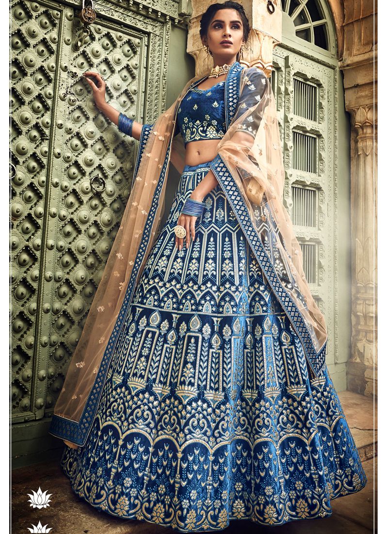 The rich, deep blue is definitely the one for grooms and brides who want to stand out through and through. This colour especially suits the royal reception look. The evening and night parties in this colour are ought to be more delightful than ever! Blues took over the fall 2020 runway colours, with classic blue being a major stand out as Pantone’s Color of the Year for 2020. It’s a deep but vivid blue that is extremely versatile, and while it still exudes the calm inherent to blue shades, it’s also rich with possibility.
Shades of Gray
This one is not a traditional or classic choice for weddings, yet it is an experimental one! Gray is having a major moment for F/W 20. The neutral hue dominated the runways in head-to-toe looks. The shade came in various fabrics, lengths, and silhouettes, from suits to chunky knits and striking overcoats. The key to the tonal look is mixing various shades (and fabrics) within your ensemble, from darker ash tones to lighter heather shades.
Flame Scarlet
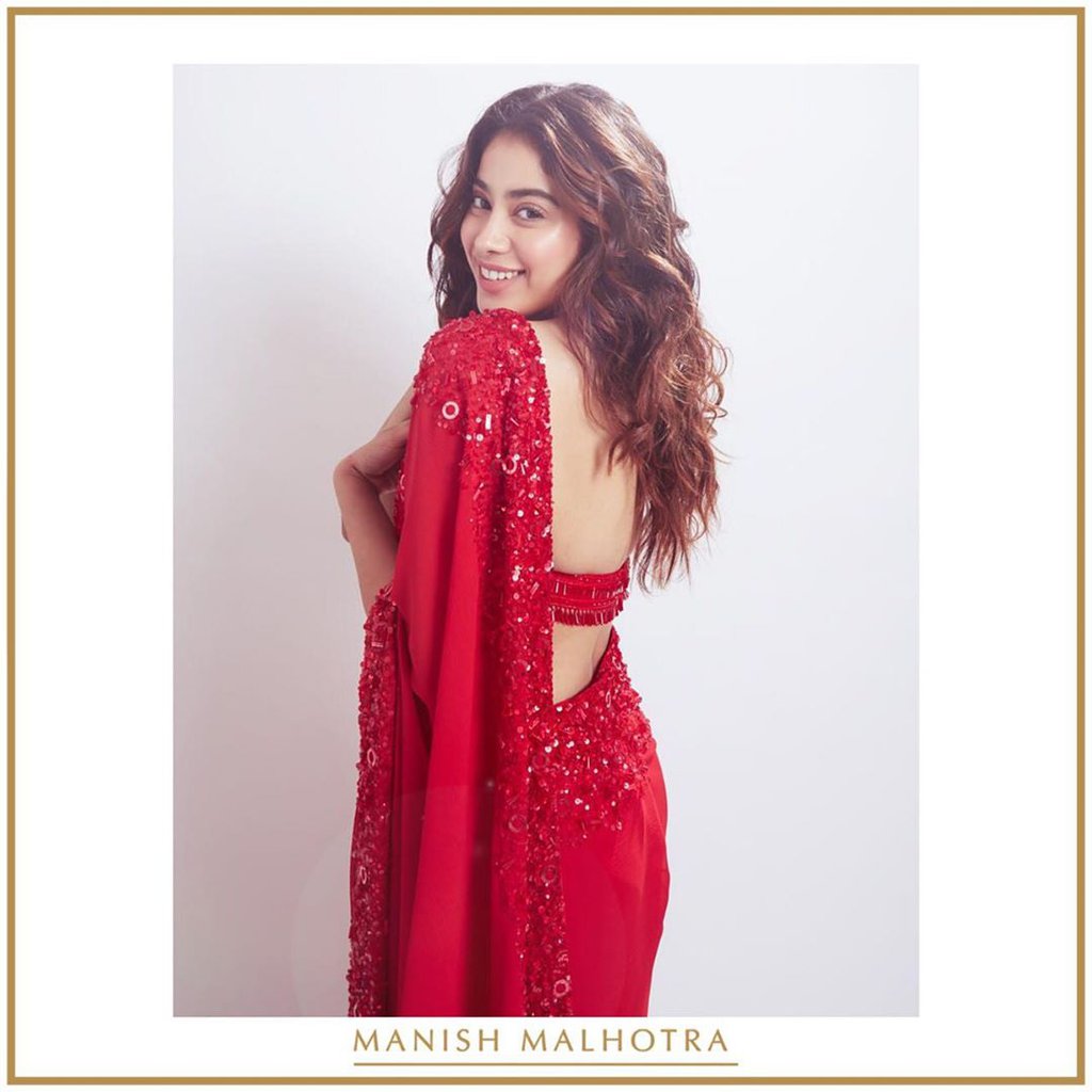
Burning bright, Flame Scarlet exudes confidence and determination. It is a medium to deep red. It is a universal colour and can be worn whether you have cool or warm undertones. It is a universal colour and can be worn whether you have cool or warm undertones. This colour looks BEST on individuals that can wear a bright medium to deep colours.
Grape Compote
This shade looks absolutely delightful on the bridesmaids and other guests. This adds a playful effect to the entire vibe. Grape Compote is a composite of mysterious and mellow purple shades. Just a few shades away from last fall’s dusty lilacs, grape compote is the shade of purple set to reign this spring. It’s a colour you don’t see often, so make sure it’s not hidden underneath a pattern or layers.
Biscay Green
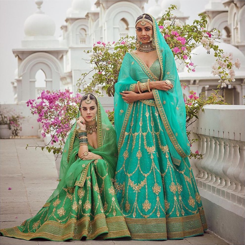 This one is for the experimental brides and grooms. An aqua shade connected to cleansing waters, Biscay Green cools and refreshes. Last spring we saw pistachio and lime green hues dominate our feeds. This year, it’s all about a cool and refreshing aqua shade. This is definitely one of the most unexpected yet dominant shades we saw on the runway. Wear it with any shade of pink for the prettiest springtime look.
Coral Pink
Coral Pink wraps you up in a warm and welcoming embrace. If you, like us, need something bright and colourful in your wardrobe right about now, look no further than this soft shade of peach. Perfect for evening affairs when it comes in textured fabrics, such as silk, sequins, and tulle. A coral pink suits the blush of a bride so effortlessly that she appears to shine out in harmony. Plus, it also confirms a more classic style.


